Showing posts with label decorating articles. Show all posts

Sunday, September 25, 2011

More Fall Decorating Trends

Last time I blogged here I talked about a few 2011 Fall Decorating trends.  And I was quite intrigued by the vaguely nostalgic feel I have seen all over the design world recently.


One of my favorite ideas is to use travel "souvenirs" in home decor.  Perhaps it is because I have a lot of postcards and photos of places I have been, but rarely find the time to scrapbook.  It would be nice to put all of those to good use.


Here are a few great ideas to put your travel souvenirs to work:


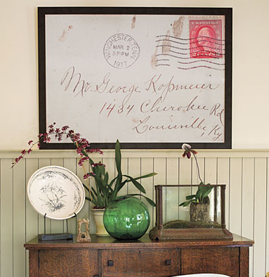
Enlarge a postcard or a sentimental envelope and frame to use as art {via}


This is actually wallpaper, but you could create a similar look using unique souvenirs and postcards to create a feature wall, or even just a smaller feature area on a wall {via}


A well-placed collection of great colored maps can serve as a great focal point in a room {via}


Using either the front, back or a combination of postcards and mod podge creates a great unique look for the top of a desk or a beverage tray {via}


So instead of keeping those postcards, photos and travel souvenirs in a show box, get them out and start decorating!!


What do you do with your travel souvenirs?


Ashley Phipps is an Interior Designer, NCIDQ #25242,
living in the Indianapolis area, and author of the blog Simply Designing.  You can follow Ashley at her blog Simply Designing, Facebook and Twitter.


Tuesday, July 14, 2009

Achieving The Nursery Of Your Dreams

7 Tips for Achieving the Custom Nursery of your Dreams
By Guest Blogger - Jennifer Reynolds

1. The days of baby blue and pastel pink for Nursery color schemes are quickly becoming a thing of the past. When selecting a color palette for your new Nursery, try a different direction and go with some non-traditional color choices. You can still achieve the feel of a sweet, calming, and serene space with a custom appeal. Some great color combinations to try are (pastel pink and brown), (pink, black and white), (orange and green), (baby blue and brown), (orange and pink), (black, white and pale green), or maybe even (fuchsia and green).

Crib bedding from Design Dazzle.
2. If you’re having a difficult time selecting the color direction, start with the fabrics. You can select the crib linens or decorator fabrics to have your lines fabricated. Try selecting fabrics for the other soft furnishings like the window treatments, bench cushions, or a decorative table cloth. Once you have some fabrics selected the paint selections will be much easier to make.

3. Your fabrics don’t always need to be ‘baby’ in theme. Try selecting fabrics that are unexpected and can transition nicely when the baby gets a bit older. Stay out of the nursery section at the fabric stores and opt for other designer options. A good choice would be a floral and paisley, or a plaid and stripe that works with your color direction.

Image from here.
4. Make a big impact with your walls. Use the walls to blend all of your fabric colors together. Try using two or three paint colors to add a graphic pattern to one wall in the room. This will help to pull all of your fabric colors together and balance the relationship between all of the elements. If you don’t want to do this with paint, use wall paper, wall murals or wall decals. They have some fabulous options available and many can even be customized to suit your taste and style.


Zebra rug from Design Dazzle.
5. Don’t limit yourself to just Baby Stores when picking up some of those finishing touches for the room. Unconventional selections will help you achieve a custom look. Look for a whimsical chandelier or lamp (I like the Tracy Porter line), a zebra stripe area rug in a surprising color combination, maybe even crystal or rustic wood drapery hardware. Your choices are limitless. Don’t get trapped buying everything in one Superstore.


6. Customize as many of the little details that you can. Change out the knobs on your dressers and changing tables, recover or add trim to your lamp shades, and hang your artwork with decorative ribbon or twine.

7. And finally, don’t forget to add those personal touches. A one of a kind art piece painted just for your new edition is a sweet touch that you will treasure forever. You can hand paint or stencil their initials above the crib or changing table or try putting together a shadow box with treasured memento's that you can add to or change out as they grow.

Try implementing a couple or all seven of these simple tips and you will surely create a beautiful room that you and your new edition can enjoy and bond in. The most important thing is that you feel great and comfortable in the room. If you’re happy, your new baby will be happy too!

Jennifer Reynolds is the owner and creative director of a Boutique Interior Design firm located in the beautiful Lake Lanier area of Gainesville, Georgia. "We inform and enlighten our clients and homeowners about the importance of surrounding themselves with inspiring, comfortable spaces." She is an expert guide, coach, and leader to those who are experiencing the process of creating their ideal home and life of their dreams. With a staff of talented artisans, trades people, workrooms, and contractors at her fingertips, Jennifer provides the essential expert resources for every project. www.jenniferreynoldsinteriors.com

Friday, May 29, 2009

Planning Your Baby Nursery

Before picture:

After picture:
You have nine months to create a spectacular space for your new addition! Not only will the space be used for your sweet infant, it will be a place where the rest of the family will spend many precious moments. So start with a plan and have fun decorating!

The Inspiration: Choose one inspirational element that will carry on throughout your nursery! This element can be anything from the crib bedding, a piece of artwork, a family heirloom or even a favorite color. As long as you stay true to the inspiration, the room will have harmony. Of course it is fun to throw a few unique, whimsical pieces here and there!

The Basics: Room to grow! Your baby will be so tiny at first but you will want a room that will grow with him or her. You will need good quality furnishings that will last throughout the childhood years. The basic needs for a baby and a young child are a crib, storage space, changing area and comfortable chair.

The Style: For the first and perhaps only time—your child’s room will reflect your style! Trust your instincts and stick to your inspirational element. Your baby may not remember their first room, but you will! There are so many options for nursery furnishings and linens so take your time deciding on what is right for your family.

The Plan: Plan your baby’s space! Measure the room walls and any door openings or windows. Arrange the furniture in a functional way. The crib should be the first thing you see when you walk into the room. It is practicable and functional to have the changing area near the crib for easy access. Use newspaper or masking tape to map out the room to make sure it works before you make your furniture purchase. It is better to buy less and add later than to buy too much and have it not fit in the room.
Kristin DeMarco
Design Dazzle Contributor

Thursday, February 5, 2009

Complementary Colors in Design

The Importance of Complementary Colors in Design
Ashley N. Phipps, Interior Designer


There is an old story of a famous Hollywood star who wanted to redecorate the interior of her home in purple. Purple is historically the color reserved for royalty and the elite, so I assume that it only seemed fitting to her that she have her home reflect that status. She hired a designer to help with her project. She made it very clear to the designer that she wanted to use only purple in her space. Under no circumstances was there to be any yellow in the space, as she deplored the color yellow. So, as any good designer would do, she took her client very seriously and together they meticulously planned the perfect home, using purple almost exclusively. One of the few deviant colors in this space was the neutral tan carpet. I can only imagine how many times the designer checked and rechecked her work throughout the entire design process to make certain that all was ordered correctly.

Once everything was installed, the designer received an irate phone call from her client; she was livid with the designer for the yellow carpet in her home! I can only imagine how frustrated and confused the designer must have been. She checked and rechecked all her orders and delivery slips to ensure that everything was ordered and installed correctly, which, of course, it was.

In the designer’s meticulous designing, planning, and the care she took to ensure that the client had an exclusively purple design, she neglected one crucial color theory principle: when the eyes are overwhelmed with one color, both the eye and the brain, seek the respite associated with the color’s complement. The brain automatically seeks out the color’s complement and, if it cannot be found, it will create the illusion of that color in the space. In the case of this home, the massive amount of purple overwhelmed the senses and caused the eye and brain to seek out and create purple’s complementary color, yellow, in the tan carpet. There was, in fact no yellow in the space, but the space was designed in such a way that the illusion of yellow carpet was created, thus making an angry client and what I can only imagine would be a mortified designer.

The moral of this story is quite simple: when designing a room, it is important, in order to create a calm and peaceful atmosphere - one in which the eye and brain can relax - to incorporate both a color and its complement.

Complementary colors are colors that are opposite each other on a color wheel. Thus red and green are complements, purple and yellow are complements, and blue and orange are complements. Complementary colors are interesting to work with in spaces, because, when placed beside each other in equally intense forms, they can almost appear to vibrate. This is not the effect most of us want in our homes. But, when placed tastefully in a room, they can create a wonderfully colorful, yet incredibly well designed, sophisticated room.

When working with complementary colors it is not important, and generally not advisable, that the complementary colors exist in the room in equal parts. Thus if one prefers purple to yellow, only a tiny bit of yellow need be placed in the primarily purple room. It is equally important to note that the complementary colors do not need to exist in the room in equal saturation (intensity) or in equal value (lightness or darkness). We often see rooms with red and green in them. If both red and green are equally bright and saturated, we typically think Christmas. If the green is a bit more subdued (think sage green) and the red is a bit richer and warmer (think a deep, dark red) then both colors can exist in the space without it looking like Christmas.

Complementary colors are fun to experiment with in a room and can help create the contrast, movement, and richness that most of us want in our spaces. It is the goal of every one of us, whether we be a professional designer or a layman redecorating his or her home, to remember that when dealing with color, it is not always as straightforward as we would hope. Color is seen, not on its own, but in relationship to the colors and the light surrounding it. Color is instrumental in creating the mood and feel of a room and is one of the most powerful tools we have in the design world. It is important to exercise care in how we use color and to realize that using only the colors we love can create unwanted effects in our space.

Be bold, be creative, and remember to use color wisely.

Rug showing the use complementary colors: green and red. Because neither color is too bright, the subtle sage green is offset by the rich red accent border without being too bold or overwhelming.


This children’s rug demonstrates the subtle use of complementary colors. Because pink is considered to be a tint of red, green and pink are used here as complementary colors in this rug
creating both vibrancy and balance.


Because there is so much yellow in this children’s room bedspread, is it important that yellow’s complement (purple) be used somewhere in the room. Complementary colors do not need to exist in a room in equal parts; they just need to exist. Note in this example that purple can be found in the nearby artwork on the wall.

Check out our current giveaways going on now until the end of November. Click here for more info.
Tuesday, December 2, 2008

Designing for Kids with Confidence

The most fun you can have in decorating your house is with your kids’ rooms. Here are a few tips to help you design with creativity and confidence…

Tip #1 – Be Courageous
One of the most common questions I am asked is “Should my child’s room flow with the rest of the house?” This is a valid question, and the answer is if you want it to. This is a design decision that has no right or wrong answer. My own personal opinion, though, and I won’t hold back here – is let your creativity really shine in this area. Your children are wondrous, expressive little beings, and although black teen walls and acid yellow ceilings may be out of the bargaining range, with a little compromising I believe that both you and your kids can come to a happy medium on all design decisions.

Tip #2 – Color Has No Gender
Pink and blue, pink and blue, zzzzzzzzz… I know that we’re all brainwashed in this area, partly because bedding manufacturers are keeping it alive with limited selections. There are so many wonderful colors in the spectrum, try to think outside the box when choosing your children’s color schemes. Greens, golds, oranges, reds are also colors that want their time to shine! Your boy’s future manliness will not be stunted if his room is red! Nor will your daughter’s femininity be at risk if her room is periwinkle. Find a comforter that they love and build from there. My 15 year old son (who is very manly, by the way) refuses to give up his Caribbean colored comforter from when he was two years old, even when I pointed out that it has some hearts on it…Tip #4 – Plan for the Long Term
The cycle of child development and the “I hate my room” syndrome seems to go like this:
Girls:
□ Infant room (whatever Mommy wants)
□ Big Girl room (5-7 years old, which includes princesses, fairies, Disney character themes, gardens, slightly deeper pastel colors like rose and lavender, etc)
□ Teen room (11-14, which includes BRIGHT COLOR, plus all their favorite things that make them them)

Boys:
What room? Seriously, plan on changing your daughter’s room at least twice during her short stay in your lives. By the time she gets to Teen Room, even though she may only be 11, the choice really should be hers (mostly). This is the time when her self expression is at its highest; she is discovering who she is and how that fits into the world. Give her plenty of places to write down her thoughts (white boards, chalk boards, graffiti walls) and hang her pictures (cork walls behind the door work really well). Try and give her some furniture that is mobile so that when she wants to re-arrange her room (this could be weekly), she will be able to have some play in that area. My daughter’s desk, night table, and dressers are on wheels, which also make it easier for her to vacuum hint, hint!

Boys are so easy - for the most part, it’s about their favorite team or hobby. Be careful not to get too themed because when they get tired of the particular favorite they will be too shy to tell you that they hate their room (unlike your daughter). My son was a chess champion at age seven (yes, I’m bragging) and I wanted to do a huge chess mural in his room. By the time he was nine, he was into juggling, so I was really glad when he said “no thanks” on the mural offer. Most boys just want a “cool” color (browns, greens like olive, sage, or gray-green, or grays are nice alternatives to blue). Resist the urge to give in to painting their room the colors of the favorite team – be careful because Dad will back them up on this – team colors are STRONG and will not create a good environment for anything but video game playing or wrestling.

Most of all, have fun, listen to your kids, and use the wonderful tools of decorating books and magazines that are available everywhere. If you get stuck, just call on the pros, we’re here to help!
Written by Susie Kades of 4wallscolordesign.com. And remember, "better living through color"!